The interior decoration market in 2026 is structured around a shared observation among industry professionals: design choices are made for the long term. According to the 2026 Houzz & Home Study, published on September 22, 2026, 61% of American renovating homeowners surveyed planned to stay in their homes for at least 11 years after renovations.
This data, although from the American market, reflects a shift in perspective that also affects the decor trends offered in France this year: decoration is no longer seasonal; it is about creating a space that makes sense for long-term living.
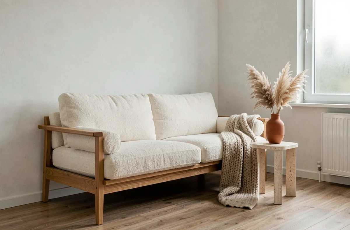
Antique furniture and new pieces: the mix that replaces the total look
Online competitors extensively detail the trendy color palettes and materials. Less often discussed is the relationship to time in the composition of a room. The fall 2026 Houzz report, based on interviews with nearly 50 design professionals, notes that interiors increasingly resemble assemblages built over the years, where a vintage armchair coexists with a contemporary table.
This principle changes the way furniture is purchased. Instead of renewing an entire living room, one integrates an antique piece (dresser, mirror, light fixture) into an existing ensemble. The result is an interior that tells a story, as opposed to a static catalog. To explore associations between styles and eras, the Cherry Déco decor universe brings together pieces that facilitate this type of composition.
An interior built over time appears more personal than a space bought all at once. This is the difference between a decorated space and a lived-in space.
Natural materials in decoration: less predictable uses
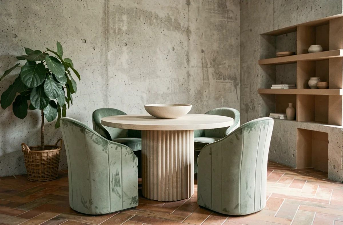
Wood, stone, linen: these materials have been featured in every article on decor trends for several years. What changes in 2026 is their positioning within the room. The same Houzz report mentions the growing interest of professionals in artisanal tiles, softened or textured stone finishes, and worked plaster.
Specifically, stone is no longer confined to kitchen countertops or bathroom floors. It appears as a backsplash, on wall shelves, or as a lamp base. Textured plaster replaces smooth paint on an accent wall, adding relief without adding color.
Three concrete applications to watch
- Artisanal tiles laid in irregular format on a living room wall, not just in kitchens or as backsplashes, to create a lively surface that captures light differently depending on the time of day
- Raw wood used as a headboard or niche cladding, where one would expect fabric or wallpaper, with species left unvarnished to preserve their natural grain
- Hand-worked plaster as an alternative to paint, applied in layers to produce subtle tone variations on a single wall
These uses share a common point: they move a familiar material out of its usual context. The element of surprise comes from the placement, not the material itself.
Transformative Teal and earthy palettes: what the 2026 shades really change
Transformative Teal, named color of the year 2026 by WGSN and Coloro, captures a significant amount of media attention. This deep blue-green works well as an accent wall or in textiles (cushions, curtains), but its actual adoption in French interiors remains to be measured: bold shades are appealing in photos and on social media but do not always find their place in a 20 m² living room.
Earthy palettes (clay, sand, terracotta) present a different profile. They integrate more easily into everyday living spaces because they tolerate the variable natural light of French homes, which are often less exposed than the Mediterranean or Californian interiors presented in magazines.
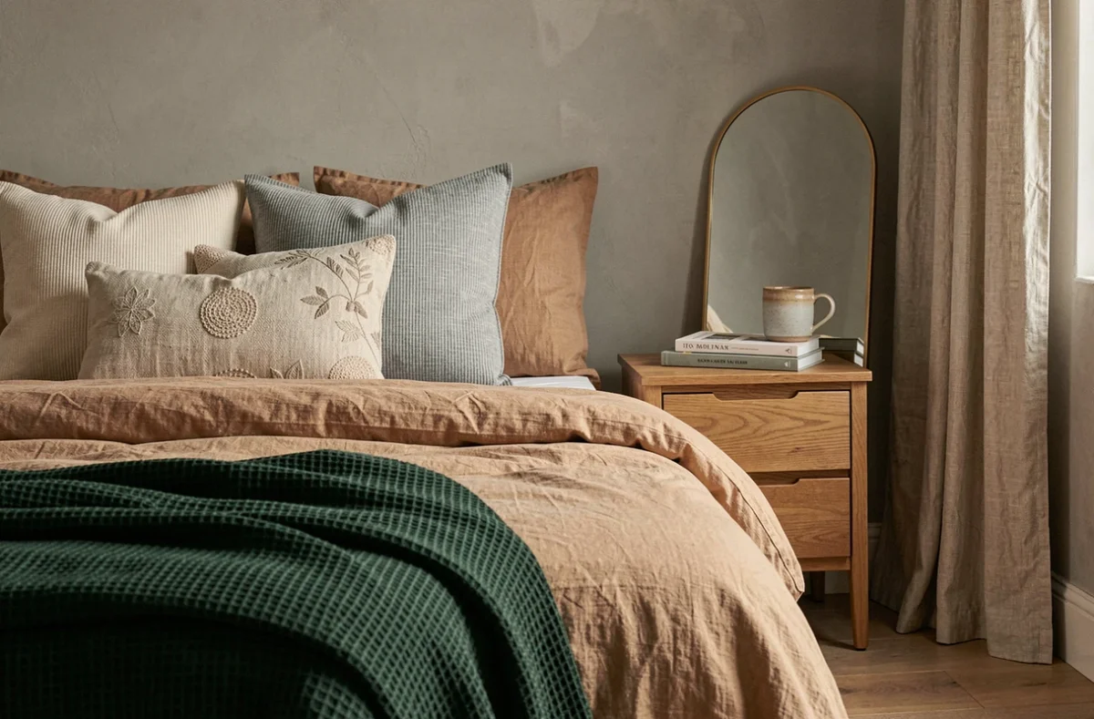
Earthy shades better withstand the variable natural light of French homes. A clay-colored wall remains legible whether illuminated by direct sunlight or a cloudy sky, whereas Transformative Teal can turn dull gray in the absence of bright light.
How to choose between a bold shade and a neutral palette
The question does not arise in the same way depending on the room. In a passage space (entryway, hallway), a bold color creates a visual stopping point without risk, as one does not linger there long. In a living room or bedroom, a neutral base complemented by colorful touches in textiles or objects offers more flexibility for evolution without repainting.
Pairing a sand-colored wall with a sofa in a deep fabric (forest green, midnight blue) creates sufficient contrast without saturating the room. This is a more reversible approach than an entire wall painted in a bright color.
Sustainable interior decoration: beyond the eco-label
The term “sustainable” accompanies almost all decor trends presented this year. In practice, sustainability in decoration is measured less by a label than by the actual longevity of the choices made. A solid wood piece without chemical finish ages better than a particle board panel covered with veneer, but it costs significantly more at purchase.
The Houzz data on homeowners who consider their home their “forever home” (44% of renovating homeowners in the American study) sheds light on this logic: when planning to stay long-term, one accepts a higher initial investment in a piece of furniture or covering because the cost per year of use decreases.
This approach has a known limit: the available data pertains to homeowners who can afford renovations. For renters or those on tight budgets, sustainable decoration leans more towards reversible choices (paint, textiles, lighting) than high-end furniture.
The decor trends of 2026 outline an interior where time works in favor of the occupant. Materials that patina, furniture that transcends trends, colors that do not tire the eye after six months: the best decoration this year is the one that will not need to be replaced next year.